As a preliminary task before creating the actual music magazine; I created a front cover and contents page for a school magazine using Photoshop. Before doing this however I looked at existing school magazines to draw inspiration from. I then analysed two of these school magazines in detail looking at all the codes and conventions that were used. Once I had collected my ideas from the market research I started to design on paper the basic outline for my magazine and plan the images I would later go on to take.
After all the preparation I had done, I started to construct my school magazine. I began by taking the pictures I had planned: students behind their art work and one student who was working on her piece of art taking into consideration the natural light. As my main image I had a side angle of the school. I then edited the images on Photoshop for example; I changed the size of the images to fit on the page by cropping them. On the school building, I altered the contrast and brightness to give an artistic affect; following the main stories in the magazine. After this I added text to create a contents page and stories on the front cover mainly using plain white font to make it easy to read. The main stories were about students achievements in the art department. I called my magazine 'Bay Time' which was in a larger Photoshop font, this worked well. It consisted of the blue colours used on the school logo. This was typical of previous existing school magazines I analysed.
Diary Entry 2
Diary Entry 2
In the last few weeks we have been studying the different codes and conventions of a front covers, contents page and double page spreads. We did different tasks to help us understand the codes. One task was when we memorised and copied a front cover, we had thirty seconds to memorise everything and copy it down after the time had finished. Different members of the group went up until we created a rough copy. This helped us familiarise ourselves with typical feature that the music magazine companies use. Additionally as research looked at all the elements they traditionally use and how it works for their target audience following their genre of music.
Once having a good understanding of what is generally used, I created a mind map of initial ideas I would use on my magazine. This included ideas for names, stories, colour schemes, images, artists, music genres and other features. This helped generate interesting ideas. I used the existing magazines to help. As more preparation for construction I made a questionnaire to ask my target audience. When carrying out my research I got a select number of people and interviewed them in a focus group, discussing features of the previous music magazines. This helped my get a general concept of what attracts them into buying and what they like and don't like about them. When analysing my results I got a good understanding and overview of what i would like to use in my magazine.
Once having a good understanding of what is generally used, I created a mind map of initial ideas I would use on my magazine. This included ideas for names, stories, colour schemes, images, artists, music genres and other features. This helped generate interesting ideas. I used the existing magazines to help. As more preparation for construction I made a questionnaire to ask my target audience. When carrying out my research I got a select number of people and interviewed them in a focus group, discussing features of the previous music magazines. This helped my get a general concept of what attracts them into buying and what they like and don't like about them. When analysing my results I got a good understanding and overview of what i would like to use in my magazine.
Diary Entry 3
As well as preparing through target audience research I analysed in more detail previous existing magazines. I looked at 5 different front covers, contents pages and double page spreads of different magazines; however they were mainly the ones that followed the indie/ rock genre I was aiming to also follow. I looked at Mojo, NME and Q as they are quite similar with their conventions. This also helped me generate even more ideas for my magazine. I studied the images, text, font, layout and how Photoshop had been used. I found that the images had been edited mainly by touching up the band or artists faces or cutting them out and putting them against a background; although most had plain backgrounds. However when looking at the images they appeared like they were good quality to begin with so limited Photoshop was needed to be used. It was typical for the font to follow the images view; for example an in your face image of Lilly Allen was accompanied with what appeared to be letters cut out from a newspaper. This research took awhile to create as it had to be very detailed in order to benefit from the exercise.
Diary Entry 4
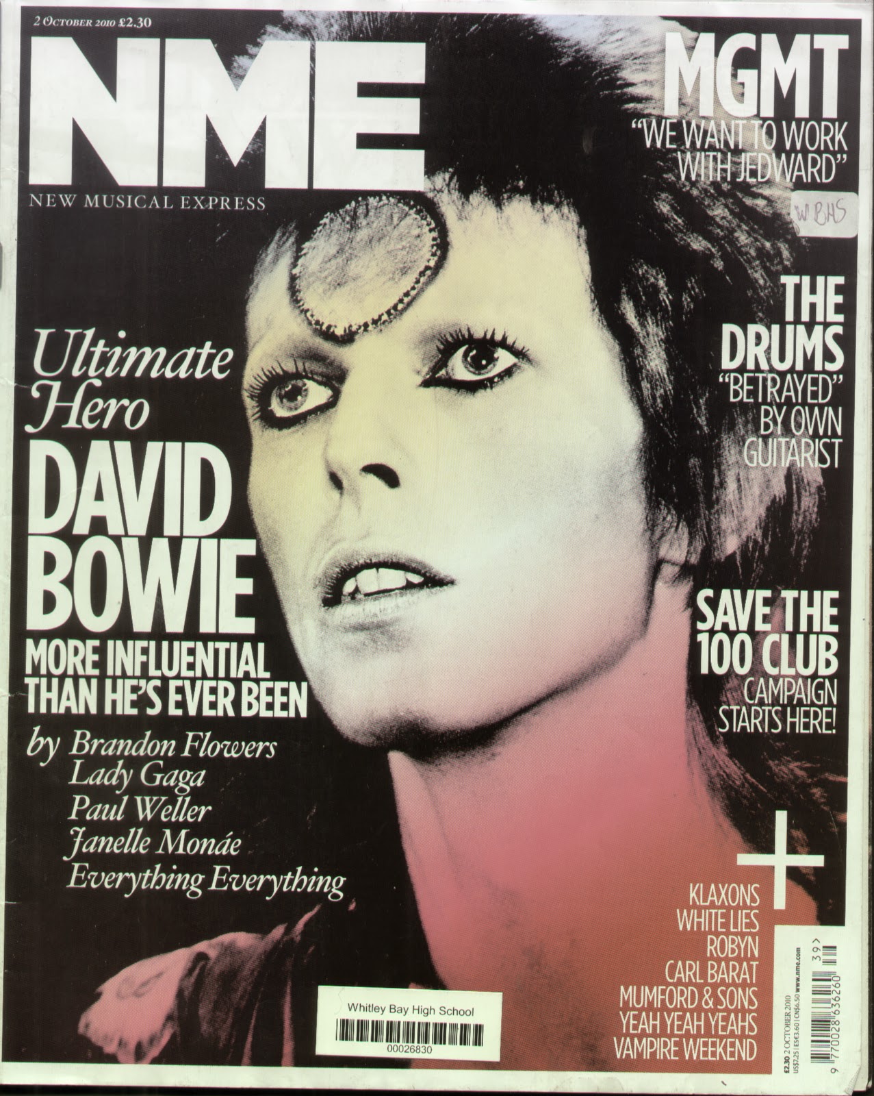
Continuing to carry out my research I looked in detail at five different front covers, contents pages and double page spreads of the genre of magazines I wanted to base mine on. Whilst analysing all the pages it helped me get a better understanding of why the creators choose particular colour schemes and images etc. This took me awhile as I wanted it to be as accurate and helpful as possible. The genre I wanted to follow is indie/ alternative and new music. Therefore I choose to look at NME, Q and Mojo. This gave me a good understanding of why they use the conventions they use and to what effect. It also helped me gain ideas for my magazine, for example, the colour schemes and fonts. I looked at a copy of NME that had The Stokes as the main image on the front cover. I enjoyed the colour and font that they used and thought about using this on my magazine as a style model. I then uploaded all my analysis's onto Blogger and scanned the images of the magazines I used to follow text.
Diary Entry 5
Almost ready to construct my magazine, I had to plan the images I was going to take. I choose 3 existing images of artists I wanted to try to remake and change. Also one image of a made up artists I would create myself. I planned where I would take it, when, who my model would be, how long it would take and many other questions until I felt prepared. I also drew a version of what I initially wanted the front cover of my magazine to look like. Once doing this i was ready ti start creating my magazine using Photoshop. Firstly i started i focusing on making the front cover. I found style models in two issue of NME one of which i based the background colour of the magazine a style of font for the title and the other in which helped me with a layout plan. I opened blank Photoshop document and changed the background colour to a light shade of blue, following my model and created the title of my magazine being "PYRO." I used a font i found off a website.
Additionally on the Thursday of the week i found a friend to model for my Ellie Goulding story and i dressed her up and took photos against the white background in the studio. However as the background was in high demand i was the last to take my photos which resulted in me rushing them which affected the quality and the accuracy of the image i was trying to re-create wasn't very good. Therefore i had to re-take the image again. At the end of the week i hired a camera so i could take images of my made up artist 'Paloma T' out of school. On Sunday i dressed up my secound model and took pictures in a field of daffodils, around an estate against a brick wall, up and in front of trees and sitting on top of walls. As i took an hour to get good quality images this will benefit me, as it means i don't have to edit them a lot in Photoshop and they will look professional in my magazine.
Diary Entry 6
This week i began by looking at the images in detail i had taken at the weekend. I was extremely happy with the way the photographs had turned out and decided to use the artists as my main story so she would therefore be on my front cover, contents page and double page spread. I started by choosing the image i wanted in the cover and then continued to cut it out on Photoshop using the magnetic lasso and rubber. I then added it to my cover; however i didn't think it fitted my magazine the way i had imagined; so i decided to use another photo. This turned out to be a good decision as i managed to cut it out to a high standard and place it on my background making it look professional as the photo had the attitude most existing artists have on images resulting in it capturing the audiences eye. I also added a quote from a story that will feature in my contents page and a date and price above the name of the magazine. Additionally i made a bar code and following the conventions of a music magazine also repeated the date and price above the code.
On Tuesday i took more images, this time i choose i male model who was willing to have his face painted as David Bowie as ziggy stardust. After i had made him up i took photographs; mainly close ups similar to the infamous album cover. I was pleased with the standard of these images. Although i did alter them on Photoshop by playing with the contrast. I then cut it from the background leaving a square of white. I decided i would use this as a free poster insert on my contents page.
After adding the more stories to my front cover until i felt like i had finished the rough cut stage of the page; i started to select other images i would use for my contents page. I added them to one Photoshop document. Lastly at the end if the week i wrote my article on a word document that i would use for my double page spread.
Diary Entry 7
This week i had to finish my front cover, which i already had completed, contents page, i had already started to create and double page spread, that i hadn't begun to create but had the text ready. The first two days of the week i finished my contents page by arranging the images in different sizes and playing with the layout. I added captions at the bottom of the images and outlined them in bold boxes making them look like there in sections, which again follows the conventions of a contents page. I created black boxes with big, bold, white page numbers in to follow the images with the story titles. Finally i created the text 'CONTENTS' by getting the font i liked off a website and added a background following the red i used for some of the texts on the front cover. I then rotated the text and background box so that it went down the right side of page.
My next task was to create my double page spread in two days. I managed to finish as i didn't need to alter my main image; although i did alter the brightness slightly. I made the image run over the two pages and made three white boxes on the right page and filled them with the article i had already written. I then decided that the boxes were too white so i altered it so that you could still see the image in the background whilst still having white boxes. I added the title at the top: 'WHO IS PALOMA T?' and made the colour of the font the same as the guitar in the image. I also used this for the colour of the text on the main article, however it was a shade darker. I then added a smaller image underneath the article and a quote on top of the image at the opposite side of the article. I had now finished the rough cut of my magazine and submitted it in for the deadline.
Diary Entry 8
At the beginning of the week in class we analysed each others rough music magazines and said what we thought worked and could be altered. I received eight peer analysis's and two from different teachers. I looked at the criticisms i had been given and worked on altering my magazine. I began on my front cover and looked at changing the colour so it wasn't as bright and changing the layout of the cover stories so that there were no large spaces or overcrowded text. I then changed the positioning of the + sign as it didn't work where it was as there wasn't enough text below make it conventional. Additionally i made some of the text smaller and added a story under a random quote, as i had been told it didn't make sense.
After almost completing my front cover i looked at changing the contents page so that it was less crowded. I started to re-arrange the text and images so that they weren't as clumped together and were in sections of their stories. The black caption boxes that were under the image changed to to white boxes with black text with black border around the image and caption. Finally i changed the layout of the sections as it fit better.