Thursday, 14 April 2011
Rough Cut Feedback
After completing individual feedback sheets on the rough cut of my music magazine front cover, contents page and double page spread there are many good parts following the conventions of a typical music magazine; however some sections need to be altered.
Research showed that the use of font on the music magazine front cover was demonstrated well as I used a variety of font styles. They particularly liked the use of font for the title for my magazine. They also commented on the interesting colour scheme of light blue, red, white and red; although some didn’t like the background blue colour as they thought it was too bright and not typical. Another aspect they thought was good in my project was the way the front image was cut out and edited. However one person said that the image was too dull in black and white in contrast with the background colour. Additionally, many people commented on the fact that some of the colours were too bright on the cover. I decided I would tone down the background colour on the cover and make the red used for parts of the font, a lighter shade.
The layout of the text around the image was a prominent factor that was commented on through the majority of analyses. The structuring was wrong, as some parts had big gaps and the some of the text was too large making the page look too busy. I knew I had to alter this as I struggled with the layout of the cover when creating my rough cut. On the cover I had created a plus sign; however I hadn’t put it in the right place as only one story followed after the sign. This was mentioned in my feedback. I was told that adding a banner on my cover might also look effective, so that is something I want to experiment with.
My contents page received mainly good feedback as they like the layout of the images and the images themselves and the fonts used. Although it was commented on that it didn’t follow my front cover as there were I hadn’t used similar colours, apart from the red used as a background box around the word ‘contents.’ It was also suggested that I use different camera angles if I take more images. I also needed to add branding and page numbers to the page.
I was told to add more in my ‘PLUS’ box as there were limited stories and the placing of the box on the page needed to be changed. Although the majority enjoyed the images on my page; one person was confused by the use of coloured and black and white images on the page.
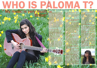
Predominantly all the positive feedback I received about my double page spread was on the quality of my main image: ‘fantastic main photo,’ ‘I love how the image spans the background. However people praised the effect of the clear white text boxes and the colour of the text. Although my double page spread still needed a lot of work as many said that the quote didn’t work and the writing was too close to the centre line. The layout was picked upon: ‘layout of text uneven and the size/ formatting of the text.’ I struggled most with the layout and I knew that this needed to be changed for my final cut It was also said that the title and the quote was in a boring font and could be changed.
I got a lot of positive feedback on my music magazine; however it was made clear that I still had a long way to go at making the magazine the best it could be.
Wednesday, 13 April 2011
Monday, 4 April 2011
Subscribe to:
Comments (Atom)


