Questions asked in my video focus group
1. What is your favourite music magazine?
2. What attracts you to your favourite music magazine?
3. Which images do you like best and why?
4. How often do you buy a music magazine and what features on the cover do you like?
5. Do you prefer a background on the image or plain?
6. Is it the band/artist that attracts you?
7. What do like about this front cover and contents page?
8. What is your favourite musician?
9. What colours would you like on a double page spread?
10. Do you like the colours used on this double page spread?
11. Do you like this double page spread?
12. What features draw your attention?
13. Do you like the image on this page?
14. Can you tell Photoshop has been used in this magazine?
15. Do you prefer text to dominate the page or a more image based spread?
16. Do you like a variety of different fonts or plain?
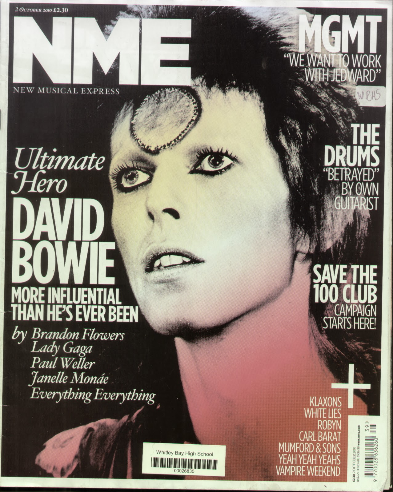 Whilst asking a select number of six people in my focus group i was able to draw conclusions from the questions above. Half of the group preferred Q or NME magazine, while the other half liked Kerrang! However although following different genres of music they still follow similar codes and conventions. When asking about their favourite images the majority of the group preferred a David Bowie image with ziggy stardust painted on his face as they liked the colours used in the image with minimal font and text around the photo. In my music magazine i could prodominantly have the colours on my image and have a basic font and have the main image have the most colour on the page in the image. They enjoyed the simplicity of the cover whilst still being visually dynamic. They also amired how the background was plain drawing attention to the image solely, the whole of my focus group's preference was the image behind a plain background.
 I could consider adding artist like Kings of Leon or Bob Dylan as an artist on the cover of my magazine as some of the people i interviewed were there favourite musicians. When looking at previous magazines they also noticed that Photoshop was used on the image of Paul Mcartney as his face was perfectly unblemished with no dark circles under his eyes. On the front cover; they wanted clear and plain font with an interesting background.
The majority of people prefered question and answer interviews of up and coming artists and what exisiting artists are doing in the future. Alot of exisiting music magazines have this type of feature on their spread subject to popluar demand. I would like to have this type of article in my magazine.
Finally a basic colour scheme was the most popular amongst my focus group. Although they didn't specify in the interview after the film had cut I asked them the specific colour schemes and red, white and black was highly recommended. However when looking at Kerrang! Magazine a member like the bold, silver writing that was used for the name of the magazine.
Finally a basic colour scheme was the most popular amongst my focus group. Although they didn't specify in the interview after the film had cut I asked them the specific colour schemes and red, white and black was highly recommended. However when looking at Kerrang! Magazine a member like the bold, silver writing that was used for the name of the magazine.
No comments:
Post a Comment