NME: 14th August 2010
Dominated by the image of Jimi Hendrix dressed in a brightly coloured army style jacket, NME's cover is very busy and interesting to look at. As it is a special edition it's focal point is the life of the rock star and all of the text is slanted around the picture and matches the colours of his clothes on the cover. The image is in the center of the page and fills the whole of the magazine front page. However interestingly his face and hand are in black and white which could be cleverly done as if he isn't there anymore because of his early death.
Font and text is very aesthetically entertaining from the colours to the different text styles. The main four colours are pink, purple, black and white. NME is a blend of the pink and purple as the title increasingly gets lighter. Additionally the title is in front of the image which traditionally with this magazine the picture is almost always in front. All of the text is in capitals; however at either side of the image the words are slanted around the picture and some follow the outline of Hendrix. This makes the page look quirky and cool. At the top of the page are two other stories in bold, pink capital letters for the title of the article and then a short text underneath in thin, black writing. There is also text across the middle of the image as the title of the main story linking to the picture which enforces that weeks main focus making people want to buy it because of Hendrix's huge popularity. At the bottom right corner of the magazine is an opportunity for a reader to win tickets for the big Reading and Leeds festivals. This will draw the viewer into buying the magazine. At the top of the magazine is another title in black capitals linked to the Hendrix story in the middle the '40' of the '40th anniversary' section is in pink the same slanted text as the articles around the image.
On the front cover also is the bar-code; however it is at the bottom left hand corner in this issue because at the other side is a competition advertisement for the readers. This isn't typical of a magazine. In the bar-code is the date of the issue's release, price and website address. The date and price is also featured at the top of the page above the title in a small black font.
The software Photoshop has been used on the page as the black and white face and hands of Jimi Hendrix has been altered by changing the gradients of colour. Also the text will have been typed, coloured and rotated around the image. The other text will have also been typed in a text box and changed colour to then some put in bold. Hendrix image will have also been altered for blemishes and dark circles with the healing tool. All of the elements will have been done on different layers so that some parts are in front of others.
I like the font used in this front cover; and the colour scheme which appeals to their target market well because of the use of colour.
 NME: 23rd October 2011
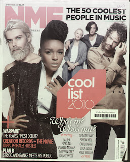
Unlike the other music magazines i have reviewed they all used one image as a world exclusive or big main story. This issue of NME has four images with different artists on. However it still uses a plain,white background. The images are all at different angles placed on top and behind each one. Again although it there is not one image it matches the main story of 'cool list 2010.' Thus attracting the reader into buying. The variety of images make it visually appealing as they are all dressed in alternative colours and look different from one another, each artist interesting different readers. This is usually done if the stars aren't that well known or don't have a huge fan base. Whilst looking at all of these magazines, all the images of the different bands/artist's are posing as opposed to natural pictures.
There isn't as much text on this front cover as the variety of images dominates the page. All of the words are again in capitals apart from one section which is typed in calligraphy hand written looking text: "Who's in? Who's out?" This is written in white along with most of the main article titles. At the top left corner is a repeat of the main story re-worded: "THE 50 COOLEST PEOPLE IN MUSIC," written in bold black it is underlined in a faint black lines. The images are again over the bold, red title and thin black blurb below.
A bar-code is placed conventionally at the bottom right corner, but in this issue it is turned horizontally opposed to landscape; however it still involves the same details, date, price and website address. The date and price is also placed at the top about the title of the magazine.Three columns below the main story reveals a selection of other articles that will also be included in the issue. This makes it more structured, ordered and easier to read. Additionally a small cross has been placed to the bottom left of the page. Also 'COOL LIST 2010' is in a hexagon that is tilted and coloured in red whilst the bold words are in white.
Photoshop software has been used to soften the feature of some of the artists and hide blemishes or darkness under their eyes using the healing wand. Also the colour of their hair had been enhanced. Each image of the different stars will have either been placed on different layers and added on top of each other that way or they have been cut out using the magnetic lasso and placed on one layer. However by cutting out the images it may have made them unprofessional looking as it is hard to get them to look accurate but it will have been easier to get them precisely ordered over the other images. Text boxes have been used in red, white and black coloured alternating fonts.
I like the different images on the page as it makes it more interesting to view and it doesn't just appeal to one type of audience. However the colour scheme is too basic and there is limited text.
Q: January 25th 2010
Q magazines image cleverly shows two images in one: a single big picture of Liam's face whilst in his sunglasses are his band members standing against a black background as if they are being reflected against the lead singers glasses. The image matches the main story at the bottom of the page in big, bold red and white text which covers the whole of the bottom third of the magazine. It shows the rock stars face in a dark glow and makes his face look rough as he is unshaven and his eyes are covered with sunglasses; thus matching the story, 'BEADY EYE KICK OFF.' The band member in Liam's eyes look clean cut compared to the ragged rock star.
Similar to the previous Q magazine, the colour scheme is red, black, white and gold. The same font is used; however they are sized differently. The main stories are in the biggest text with a preview or short description below; but this is smaller. The variety of colours and sizes make the reader want to open the magazine because it has attracted their attention. Placed at the top left corner is an empty circle with an exclusive Queen story. The layout is very square and boxy in columns at either side of the image so therefore adding a circle to the top of the page is unusual and draws attention to that section of the cover. The text also captures the viewers imagination by having short phrases about the article or the story name itself 'LIVE ORGY.' A quote is also used for the same affect and popular bands are listed on the page which indicates they will be mentioned in the magazine circulating interest.
Similarly to the NME magazine the bar-code has been placed horizontally so that it fits in with the large main title story and the date, price and website address are also included in the bar-code box. The Q title in the red box is in the foreground and is put above the picture which isn't typically done in music magazine the image is the focus because of the recognition it has already got. However it doesn't detract from the picture.
Photoshop has clearly been used to get the other band members in Liam's sunglasses they will have done this by cutting out the image using the cut tool and placing it in the glasses then altering the colour of the background by taking an original sample of the background sunglass then repeating the process so that it blends in. Also the colour of the image looks darker this will have been done by altering the contrast. Liam's cheekbones and lips also look more defined which have been altered using this software. Text boxes have been used and the colours of the text have been changed. There is a gold cross on the page which will have been created by using the basic line tool. Finally all the parts of the issue were done on separate layers so that text is in front of the image or the Q is in the foreground.
All together this is a good music magazine the image is in your face which serves its purpose and the text is well structured at the sides. The main conventions are followed which is also appealing. The style of Q is apparent as it combines new music which makes it relevant to its target audience as this is their preference.


 Whilst asking a select number of six people in my focus group i was able to draw conclusions from the questions above. Half of the group preferred Q or NME magazine, while the other half liked Kerrang! However although following different genres of music they still follow similar codes and conventions. When asking about their favourite images the majority of the group preferred a David Bowie image with ziggy stardust painted on his face as they liked the colours used in the image with minimal font and text around the photo. In my music magazine i could prodominantly have the colours on my image and have a basic font and have the main image have the most colour on the page in the image. They enjoyed the simplicity of the cover whilst still being visually dynamic. They also amired how the background was plain drawing attention to the image solely, the whole of my focus group's preference was the image behind a plain background.


 Q Magazine: 21st January 2009


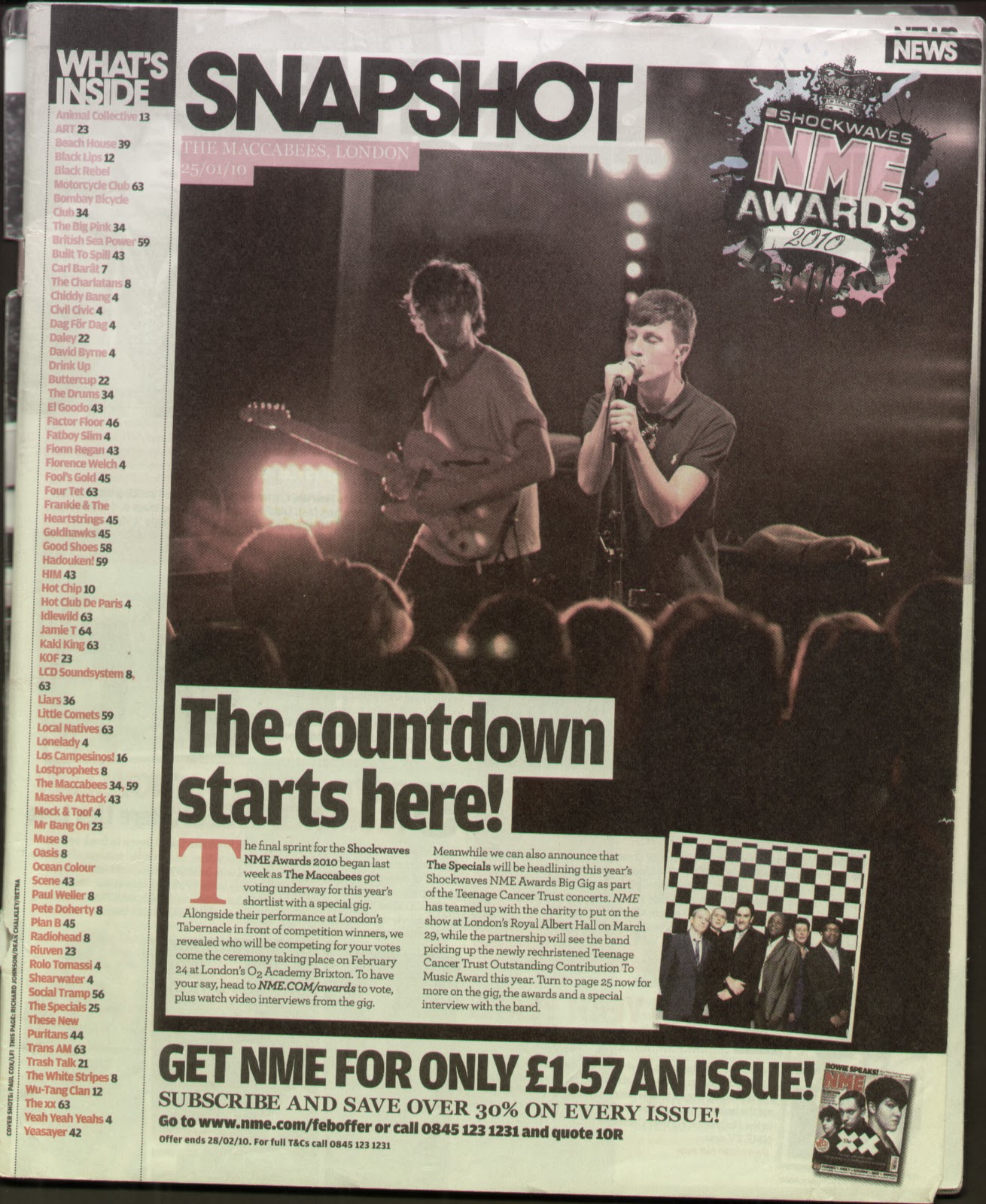 Although from the same magazine the layout of the contents page is drastically different to the previous one. The image dominates the page and there is a short story which follows it. The image is of the band: The Maccabees on stage. It is a natural picture unlike the posed images of bands that music magazines frequently use. The photo is a live action shot as you can see some of the audiences heads and the lead singer feeling his music as his eyes are shut and his face is strained. At the top of the picture is a date, title of the band and location of the gig written in capital white typing in a small red box. The only other images is a small, square posed photograph of another band on top at the bottom of the live picture. They are standing before a checked background in suits and appear to be an old band from the age they look. Additionally as some extra advertising there is an image of an old NME magazine which follows with subscription details.
 NME: 23rd October 2011


