
Contents pages are very important for a magazine, when browsing in a shop deciding whether to buy or not people will skip to the contents page to get a quick overview of exactly what is in. Once the magazine is bought and they only want to read stories of interest the page will tell them quickly where to look.
Different font is used in the page. 'INSIDE THIS WEEK' introducing the page is in big, bold, black text introducing the contents page. Some of the article names are also in bold black however they are a lot smaller fitting in the boxes. However the other stories names are in lower case and in italics. Although some stories aren't in bold but the blurb under the bottom is it alternates for a good variation making it look quirky. The small main list is written one above each other in drop capitals and the page numbers are in bold like most of the boxed features are but they are smaller in listed box. The 'PLUS' titling the column also in italics and it has extra swirls coming off the P.
The page is set out in three seperate columns and after each story is a faint black line which creates a box for some of article names. However the bottom half isn't as structured keeping in line with the other two columns as it is the main list of what is in the magazine.
i like the way the stories are ordered into column and boxes. However i don't like the minimal colour scheme as it makes it look plain, the images almost justify the lack of colour but i'd prefer it to be as busy as colourful as the cover.
NME: 6th February 2010
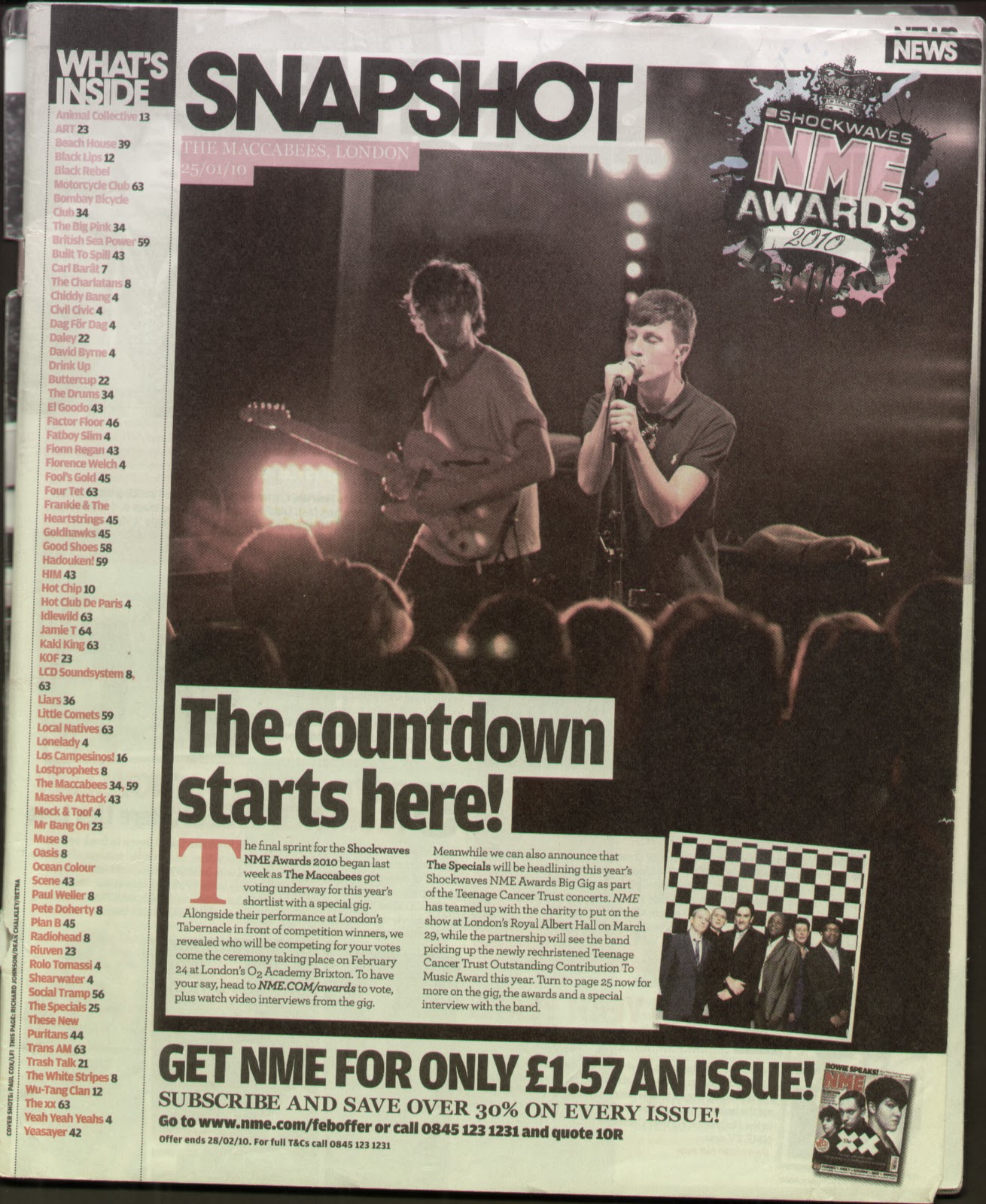 Although from the same magazine the layout of the contents page is drastically different to the previous one. The image dominates the page and there is a short story which follows it. The image is of the band: The Maccabees on stage. It is a natural picture unlike the posed images of bands that music magazines frequently use. The photo is a live action shot as you can see some of the audiences heads and the lead singer feeling his music as his eyes are shut and his face is strained. At the top of the picture is a date, title of the band and location of the gig written in capital white typing in a small red box. The only other images is a small, square posed photograph of another band on top at the bottom of the live picture. They are standing before a checked background in suits and appear to be an old band from the age they look. Additionally as some extra advertising there is an image of an old NME magazine which follows with subscription details.
At the left of the page is a long list in red writing with black page numbers telling the reader 'WHAT'S INSIDE.' The title is written in bold white with a black background. The colour of the text matches the logo of the NME AWARDS which is placed on top of the main image in the left corner. The logo also includes other colours splashed in the background like paint. The text on the logo is different, sections look like it has been hand written whilst other parts look like its rustic with small straight chunks out of it.
The layout is simple the image takes over most of the page more that two thirds. There is a long column for the list of articles in the magazine. Finally there is a small section for the advertisement at the bottom of the page. It is very ordered and makes it pleasant to view.
I don't like this contents page as much as some of the others because they have focused on the small story and made the image the most predominant part of the page. The first column with the list on almost looks like it has been squashed into that section of the magazine. However i do like that there is a main image on the page as some content's use many which can make it look like a mess.
No comments:
Post a Comment