Friday, 4 March 2011

Diary Entries

Diary Entry 1

As a preliminary task before creating the actual music magazine; I created a front cover and contents page for a school magazine using Photoshop. Before doing this however I looked at existing school magazines to draw inspiration from. I then analysed two of these school magazines in detail looking at all the codes and conventions that were used. Once I had collected my ideas from the market research I started to design on paper the basic outline for my magazine and plan the images I would later go on to take.

After all the preparation I had done, I started to construct my school magazine. I began by taking the pictures I had planned: students behind their art work and one student who was working on her piece of art taking into consideration the natural light. As my main image I had a side angle of the school. I then edited the images on Photoshop for example; I changed the size of the images to fit on the page by cropping them. On the school building, I altered the contrast and brightness to give an artistic affect; following the main stories in the magazine. After this I added text to create a contents page and stories on the front cover mainly using plain white font to make it easy to read. The main stories were about students achievements in the art department. I called my magazine 'Bay Time' which was in a larger Photoshop font, this worked well. It consisted of the blue colours used on the school logo. This was typical of previous existing school magazines I analysed.

Diary Entry 2

In the last few weeks we have been studying the different codes and conventions of a front covers, contents page and double page spreads. We did different tasks to help us understand the codes. One task was when we memorised and copied a front cover, we had thirty seconds to memorise everything and copy it down after the time had finished. Different members of the group went up until we created a rough copy. This helped us familiarise ourselves with typical feature that the music magazine companies use. Additionally as research looked at all the elements they traditionally use and how it works for their target audience following their genre of music.

Once having a good understanding of what is generally used, I created a mind map of initial ideas I would use on my magazine. This included ideas for names, stories, colour schemes, images, artists, music genres and other features. This helped generate interesting ideas. I used the existing magazines to help. As more preparation for construction I made a questionnaire to ask my target audience. When carrying out my research I got a select number of people and interviewed them in a focus group, discussing features of the previous music magazines. This helped my get a general concept of what attracts them into buying and what they like and don't like about them. When analysing my results I got a good understanding and overview of what i would like to use in my magazine.

Diary Entry 3

As well as preparing through target audience research I analysed in more detail previous existing magazines. I looked at 5 different front covers, contents pages and double page spreads of different magazines; however they were mainly the ones that followed the indie/ rock genre I was aiming to also follow. I looked at Mojo, NME and Q as they are quite similar with their conventions. This also helped me generate even more ideas for my magazine. I studied the images, text, font, layout and how Photoshop had been used. I found that the images had been edited mainly by touching up the band or artists faces or cutting them out and putting them against a background; although most had plain backgrounds. However when looking at the images they appeared like they were good quality to begin with so limited Photoshop was needed to be used. It was typical for the font to follow the images view; for example an in your face image of Lilly Allen was accompanied with what appeared to be letters cut out from a newspaper. This research took awhile to create as it had to be very detailed in order to benefit from the exercise.

Diary Entry 4

Continuing to carry out my research I looked in detail at five different front covers, contents pages and double page spreads of the genre of magazines I wanted to base mine on. Whilst analysing all the pages it helped me get a better understanding of why the creators choose particular colour schemes and images etc. This took me awhile as I wanted it to be as accurate and helpful as possible. The genre I wanted to follow is indie/ alternative and new music. Therefore I choose to look at NME, Q and Mojo. This gave me a good understanding of why they use the conventions they use and to what effect. It also helped me gain ideas for my magazine, for example, the colour schemes and fonts. I looked at a copy of NME that had The Stokes as the main image on the front cover. I enjoyed the colour and font that they used and thought about using this on my magazine as a style model. I then uploaded all my analysis's onto Blogger and scanned the images of the magazines I used to follow text.

Diary Entry 5

Almost ready to construct my magazine, I had to plan the images I was going to take. I choose 3 existing images of artists I wanted to try to remake and change. Also one image of a made up artists I would create myself. I planned where I would take it, when, who my model would be, how long it would take and many other questions until I felt prepared. I also drew a version of what I initially wanted the front cover of my magazine to look like. Once doing this i was ready ti start creating my magazine using Photoshop. Firstly i started i focusing on making the front cover. I found style models in two issue of NME one of which i based the background colour of the magazine a style of font for the title and the other in which helped me with a layout plan. I opened blank Photoshop document and changed the background colour to a light shade of blue, following my model and created the title of my magazine being "PYRO." I used a font i found off a website.

Additionally on the Thursday of the week i found a friend to model for my Ellie Goulding story and i dressed her up and took photos against the white background in the studio. However as the background was in high demand i was the last to take my photos which resulted in me rushing them which affected the quality and the accuracy of the image i was trying to re-create wasn't very good. Therefore i had to re-take the image again. At the end of the week i hired a camera so i could take images of my made up artist 'Paloma T' out of school. On Sunday i dressed up my secound model and took pictures in a field of daffodils, around an estate against a brick wall, up and in front of trees and sitting on top of walls. As i took an hour to get good quality images this will benefit me, as it means i don't have to edit them a lot in Photoshop and they will look professional in my magazine.

Diary Entry 6

This week i began by looking at the images in detail i had taken at the weekend. I was extremely happy with the way the photographs had turned out and decided to use the artists as my main story so she would therefore be on my front cover, contents page and double page spread. I started by choosing the image i wanted in the cover and then continued to cut it out on Photoshop using the magnetic lasso and rubber. I then added it to my cover; however i didn't think it fitted my magazine the way i had imagined; so i decided to use another photo. This turned out to be a good decision as i managed to cut it out to a high standard and place it on my background making it look professional as the photo had the attitude most existing artists have on images resulting in it capturing the audiences eye. I also added a quote from a story that will feature in my contents page and a date and price above the name of the magazine. Additionally i made a bar code and following the conventions of a music magazine also repeated the date and price above the code.

On Tuesday i took more images, this time i choose i male model who was willing to have his face painted as David Bowie as ziggy stardust. After i had made him up i took photographs; mainly close ups similar to the infamous album cover. I was pleased with the standard of these images. Although i did alter them on Photoshop by playing with the contrast. I then cut it from the background leaving a square of white. I decided i would use this as a free poster insert on my contents page.

After adding the more stories to my front cover until i felt like i had finished the rough cut stage of the page; i started to select other images i would use for my contents page. I added them to one Photoshop document. Lastly at the end if the week i wrote my article on a word document that i would use for my double page spread.

Diary Entry 7

This week i had to finish my front cover, which i already had completed, contents page, i had already started to create and double page spread, that i hadn't begun to create but had the text ready. The first two days of the week i finished my contents page by arranging the images in different sizes and playing with the layout. I added captions at the bottom of the images and outlined them in bold boxes making them look like there in sections, which again follows the conventions of a contents page. I created black boxes with big, bold, white page numbers in to follow the images with the story titles. Finally i created the text 'CONTENTS' by getting the font i liked off a website and added a background following the red i used for some of the texts on the front cover. I then rotated the text and background box so that it went down the right side of page.

My next task was to create my double page spread in two days. I managed to finish as i didn't need to alter my main image; although i did alter the brightness slightly. I made the image run over the two pages and made three white boxes on the right page and filled them with the article i had already written. I then decided that the boxes were too white so i altered it so that you could still see the image in the background whilst still having white boxes. I added the title at the top: 'WHO IS PALOMA T?' and made the colour of the font the same as the guitar in the image. I also used this for the colour of the text on the main article, however it was a shade darker. I then added a smaller image underneath the article and a quote on top of the image at the opposite side of the article. I had now finished the rough cut of my magazine and submitted it in for the deadline.

Diary Entry 8

At the beginning of the week in class we analysed each others rough music magazines and said what we thought worked and could be altered. I received eight peer analysis's and two from different teachers. I looked at the criticisms i had been given and worked on altering my magazine. I began on my front cover and looked at changing the colour so it wasn't as bright and changing the layout of the cover stories so that there were no large spaces or overcrowded text. I then changed the positioning of the + sign as it didn't work where it was as there wasn't enough text below make it conventional. Additionally i made some of the text smaller and added a story under a random quote, as i had been told it didn't make sense.

After almost completing my front cover i looked at changing the contents page so that it was less crowded. I started to re-arrange the text and images so that they weren't as clumped together and were in sections of their stories. The black caption boxes that were under the image changed to to white boxes with black text with black border around the image and caption. Finally i changed the layout of the sections as it fit better.

Audience Research and Analysis


Questions asked in my video focus group
1. What is your favourite music magazine?
2. What attracts you to your favourite music magazine?
3. Which images do you like best and why?
4. How often do you buy a music magazine and what features on the cover do you like?
5. Do you prefer a background on the image or plain?
6. Is it the band/artist that attracts you?
7. What do like about this front cover and contents page?
8. What is your favourite musician?
9. What colours would you like on a double page spread?
10. Do you like the colours used on this double page spread?
11. Do you like this double page spread?
12. What features draw your attention?
13. Do you like the image on this page?
14. Can you tell Photoshop has been used in this magazine?
15. Do you prefer text to dominate the page or a more image based spread?
16. Do you like a variety of different fonts or plain?

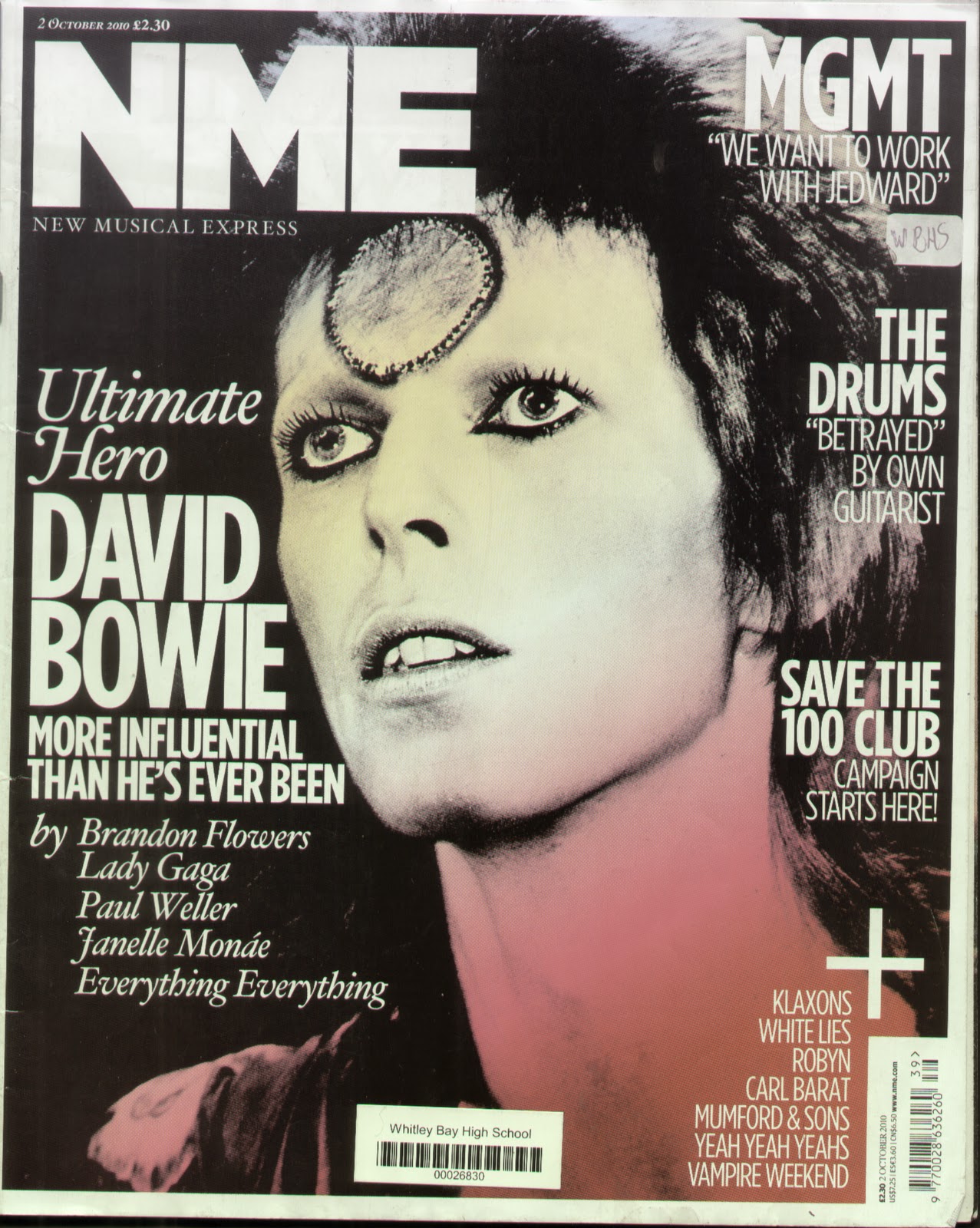
Whilst asking a select number of six people in my focus group i was able to draw conclusions from the questions above. Half of the group preferred Q or NME magazine, while the other half liked Kerrang! However although following different genres of music they still follow similar codes and conventions. When asking about their favourite images the majority of the group preferred a David Bowie image with ziggy stardust painted on his face as they liked the colours used in the image with minimal font and text around the photo. In my music magazine i could prodominantly have the colours on my image and have a basic font and have the main image have the most colour on the page in the image. They enjoyed the simplicity of the cover whilst still being visually dynamic. They also amired how the background was plain drawing attention to the image solely, the whole of my focus group's preference was the image behind a plain background.

I could consider adding artist like Kings of Leon or Bob Dylan as an artist on the cover of my magazine as some of the people i interviewed were there favourite musicians. When looking at previous magazines they also noticed that Photoshop was used on the image of Paul Mcartney as his face was perfectly unblemished with no dark circles under his eyes. On the front cover; they wanted clear and plain font with an interesting background.

The majority of people prefered question and answer interviews of up and coming artists and what exisiting artists are doing in the future. Alot of exisiting music magazines have this type of feature on their spread subject to popluar demand. I would like to have this type of article in my magazine.

Finally a basic colour scheme was the most popular amongst my focus group. Although they didn't specify in the interview after the film had cut I asked them the specific colour schemes and red, white and black was highly recommended. However when looking at Kerrang! Magazine a member like the bold, silver writing that was used for the name of the magazine.


Thursday, 3 March 2011

Friday, 25 February 2011

Music Magazine: Double Page Spread Analysis's 2

NME Magazine

http://jessicastarkins.files.wordpress.com/2009/01/article_nme_aug07_large.jpg

NME's magazine spread is full of images, bright colours and alternating sized fonts to make the article a visual feast whilst still concentrating on the content. The image of the band: The teenagers covers the whole first page as the three piece sit on a small sofa in front of a wall plastered with posters. The image shows the band relaxing in what appears to be their home; matching the story as it is an article about their life, so a casual picture seems appropriate. Colours are bright in the image which will have been altered using Photoshop. Additionally their perfect looking skin has been changed using the healing tool. Other photographs include a small live action shot of the band in the secound column at the start, which has a caption on top of the image. Also included in on the secound page of the spread is a section on other new popular bands and short descriptions about them. This is also followed with a small image to the right of the text.

Titles have all been put in capital letters using different colours which include: blue, white and black. Alternating fonts are used, the 'NEED TO KNOW,' text which is in a blue box on top of the image at the bottom left corner at an angle, isn't in the same style of text as 'THE TEENAGERS' and 'RADAR.' The fonts aren't dramatically different, some look more straight and boxed. 'NME LOVES' is also in different font as it looks like it has been written in white pencil on top of a star banner box. Light blue is the main colour that is used throughout the article. The main title is in bold, black text and has a blue, square background. Other parts that are coloured with a blue banner are: a quote from the story that is written in white, the 'need to know box' and 'radar' at the top left corner. Sections of the separate story on the page also have a couple of parts with blue backgrounds. Bright colour schemes capture the eye of the reader whilst entertaining them.

Three section are to the spread: image, article and separate story. Over the main image is boxes of information about the band and a small banner at the top. Also the main title overlaps on to the photo making it look slightly messy; like the flat in the background of the picture.The last column is a black rectangular box that cover the last third and there is white lower case text in it. All of the sections are straight facing the reader; except the information box over the image. At the end of the main article is a small red box that includes the NME website address.

Special software used to enhance images: Photoshop has been used to create a slightly unorganised banners that overlap over other sections. Text boxes have been used to create this and the fonts and colours altered on that setting.

Overall i like this spread and would consider when making my music magazine, having it similar to this style. The unorganised, whilst being organised feel and the messy background of the image. I would also use Photoshop similarly like they have for enhancing the image. This appeals to the target audience through the colours as it is aimed at my age group and above and it does appeal to me. However although it is busy and looks interesting; i wouldn't have added another story to the page as it distracts the readers attention.


Typical of the artist the font for the title is laid back using the Rastafarian colour of red that looks like it has been painted on. However black and white are predominantly used in the article. The text is written in one coloumn to the left of the page which is umconventional; however it looks like the opening page spread so normally the image is the most dominant. Under the mast head is a small summary of what the article will include is written as though it looks like it has been typed on a type writer and is outlined with a white banner. One the image to the right at the bottom is a small caption in basic small font like the rest of the column; however the text is white on the image and the text is in a larger black font. At the beginning of the paragraph is the starting letter 'K' in bigger bold text. This is typical of a double page spread.

The contrast on the image has been taken down using Photoshop the colours are less bright making the image look cool and relaxed as though he is sitting in a shack. It looks like a natural pose instead of being staged and has a background; although it is not a key image in the back it isn't like it is staged as this would contradict the artist’s ideas. Apart from the change of colours the image isn't as interesting and the font is basic which would work if the image was more entertaining.

Layout is very basic as there is only one column and the image is too the right of the spread. This isn't typical of a magazine cover story as the image would usually be to the left of the page as that is the way people read or in the middle, with text around it. This again follows the ethos of the reggae artists as he was rebellious breaking the rules. The masthead is tilted to one side to make it aesthetically pleasing.
Image and text have been used well on this page. The text is very plain and basic along with the image; however their personalities dominate the photo in font of the plain white background. The artists are dressed in black following the typical indie rock style looking cool and quirky in a leather jacket and checked shirt. The image of one of the band members has a shadow which makes the photo appear darker but very clean cut at the same time. One of the only parts of colour on the page is the red emblem on one of the bands jackets and a small red box with a caption in small white text.

Following basic conventions the text is written in three different columns with bold writing in the same font for the questions that were asked in the interview. Like previous magazine spreads the first letter of the text is big and bold. The title of the article is the name of the band which is in capital dark red letters with a small summary under in black bold text. Occasional words are coloured in red; mainly the parts of the interview where the name of the band member is in bold colour.

At the top of the page is a grey think banner that is separated by ‘CASH FOR QUESTIONS’ box in the middle which signifies it is a feature that is always in the magazine. The ‘CASH’ is in bold black text. Under the story is a bold black line and under is a small amount of text including the page number.


Thursday, 24 February 2011

Music Magazine: Double Page Spread Analysis's


NME: 19th February 2011 

The Strokes feature 
NME is infamous for its bright, eye capturing, interesting double page spreads and this issue is no different. On the first page is an image of the band: The Strokes standing before an empty flat looking cool in their rock and roll style clothes: leather jackets and sunglasses whilst standing in different poses looking like they have been caught by surprise on the camera. This is the only photograph that has been taken on this page of the band. This gives the image and article an equal balance of text to visual display which makes it entertaining to look at. The colours of the band's outfits contrast with the yellow page and pink as they are predominantly wearing black which also adds to the interest of the article. The image is very confident especially of the lead singer: this corresponds to the title: "Were Stronger Than Ever" which is a quote from the band.

Font has been used throughout the page which is similar; however capitals and colours have been altered. The title is in bold, pink capitals and is slanted to the left hand side which adds to the quirkiness of the magazine. Below is short text also in pink although it is in capitals and a lot smaller, summarising the articles main parts. There are two higlighted words in black. At the beginning of the article the T of 'The' is bigger in bold pink and covers 5 lines. Similarly this has also been done, but smaller at the start of the secound paragraph. The main story is written in three columns and is in plain, black, lower case text which is typical of an big article.

Additionally under the main title is a faint black banner with the name of the journalist who wrote the story. It is also at a slant with the text. The layout is very simplistic drawing attention to the image and story itself. However the colours: yellow and pink make it seem fun and appealing. 

Photoshop has clearly been used to enhance the image making the rock stars have good skin with no dark circles underneath their eyes this will have been altered using the healing tool. Also the photo is a lot darker so the contrast will have been changed. The text will have been coloured by creating a text box and the title rotated slightly. Also the background yellow will have been added on a lower layer whilst the text was added over the top. 

This double page spread is very appealing to me as i like the cool urban feel to the image and the colours contrasting against each other on the page. I also like how their is not a lot of text and the image is one of the main focuses. It is clear that this type of article would be targeted at a younger audience: teenagers and music fans in their twenties due to the young band and bright colours.           


http://dianasarkova.files.wordpress.com/2010/02/double-page-spread2.jpgQ Magazine: 21st January 2009


Image and title dominating this picture it is very aesthetically appealing to younger audiences due to the lack of text and the image that is very dominant and 'in your face' as it matches the main title: " People think I'm an attention seeker, but I'm just honest." The artists clothes are one of the only sections of colour on the page as most text is in black and white with hints of red. Lilly Allen's pose is confident as she wears a red checked shirt and has her hair cut short which is quite masculine symbolising and justifying the story as she is appearing tough. Her only feminine features is her necklace and eye makeup.  As the text is very busy and the image is the main part, the background is plain white as it would have made the article too hectic and would have distracted away from the article; although this isn't the focus on the page. 

Automatically capturing the readers eye the main title shows great design and detail as it looks like different letters have been cut out of a newspaper and stuck on the page. Thus also corresponding against the story as it states that people say she is something, but she is not she is the opposite. Different letters are in white bold capitals whilst some aren't, they all have a black box background and take up two thirds of the page. Other text is in lower case black and is centered at the bottom of the spread. Occasional words such as: 'Lilly Allen' have been highlighted in bold red. Alike the previous magazine double page spread, the first letter of the word in the story is bigger in bold. 

Unconventionally, columns are in four sections which again adds to the rebellious feel of the piece. There is a small description of the story above. The main title is scattered on top of the page and is on top of a part of the photo. Layout isn't too over the top as the image and text speaks volumes and it doesn't need to be over complicated. 

The software Photoshop have definitely been used to create the text using text boxes and cutting tools. The image appears flawless which of Lilly Allen's face which will have been altered using the healing tools. Finally the colour of the image has been brightened on the contrast setting. 

Overall this spread is quirky and interesting to the viewer; however i don't think it matches it's actual target audience of young adults as this type of article could appeal to younger people like it is a feature in a twelve year old's 'SHOUT' magazine.Although i think the text would distract a child of that age from reading. The style that it has tried to capture is a rock star, rebellious look which i think they have managed to create. It could be improved by making the title smaller and adding more text; then it may appeal to their older audiences.

Music Magazine: Contents Page Analysis's 2

Q: October 2008


https://blogger.googleusercontent.com/img/b/R29vZ2xl/AVvXsEgf5dvbTQrlUcpUcNjUA9qvL_ktCMZfsmmX0i3HjoaZhZ5rV_wnISI9zhvJ6MklpyG-aNeLle6aRrxcbr0m_rnklaEo6WZw7mMBJJqts6tnk3vjrJU6dd-K3isL0807LhUqtqT62Mjk8GY/s1600/q-contents.jpg 

Q's old contents page follows all the codes and conventions when making a magazine. It is similar to a previous issue of NME; however the main image isn't as large and the column which lists what is in the magazine doesn't appear as forced to fit in. The focus image is of a band, The Courteeners in the country on top of a hill as they pose in a shirt, t-shirts and jeans whilst the lead singer wear sunglasses to follow the rock and roll look. Unlike the other magazines that were previously viewed most of the images didn't have a background. Whereas both of the photographs on the page have more than just the band or artist. The secound image located at the bottom in the middle is of the artist: Nick Cave in an expensive looking suit stood leaning on a pillar. By including a background it makes the picture more visually interesting than the stereotypical band in a studio wearing modern clothes, sunglasses looking cool. 

All the font on the page are similar and the text is all in drop capitals. Although the colours are different following the front cover's colour scheme.  The basic trend of the text is: page numbers in bold red at the start of the sentence and the article title in black. Also there is a brief description about the story in lower case black letters. In the middle of the features list is a box that follows written in bold gold for the title: OASIS SPECIAL then like the other stories the text is in black; however the page numbers are coloured in gold. This part of the page is also in larger text. The bigger parts of the section are: CONTENTS, which is in a black banner at the top of the page and the text is bold white. Other sections that are larger are the title: FEATURES, Q REVIEWS, EVERY MONTH and finally the main story, THE COURTEENERS. By doing this it makes the text capture the readers eye and makes the page more organised. 


Other text includes the date, magazine website URL and the blurb after the Q reviews section. Additionally there is a quote in a box underneath the main article teasing the viewer into reading story.  


The main image corresponds with the title of the story on top of the picture. This making the article appear the most important and interesting as it the first part the eye is drawn to. The small photo also matches the short Q review section which is listed beneath as it is one of the stories that is included. There are three columns that the page is split into left to right, the first one covers the whole page whilst the secound and third are the same size below the main image. 

I like the way the articles broken up into three different sections: features, every month and Q reviews, i like the order of the page. However i would prefer more images to break the text up more. In my music magazine i might use a background in my images to make the photo look more aesthetically pleasing. I also may put my text in alternative boxes again for neat presentation. 


Mojo: December 2010 

http://3.bp.blogspot.com/_EwMtAwK6Gac/TOJy-u0fdoI/AAAAAAAAABY/ZTCxk0icr-s/s1600/Mojo+contents+page.jpg
 
Mojo's contents page is unusual compared to previous music magazines that have been looked at. It uses a two colour colour scheme and and image predominant, although this is similar there is only one photograph on the page which is visually disturbing of the artist: Alice Cooper naked with black snake covering him. This following the style of the magazine, controversial and daring focusing on rock music and old bands. It is a very dark image and his face, hair and eyes look tired, dirty and messy. He laying in front of a plain background that is the colour for the whole page, dark grey; also following the rock and roll genre. 


The text is very simplistic in either bold red for page numbers or bold words for the titles and plain black for the description underneath. It is written in two short columns displaying the simplicity. The first column is titled: FEATURES, the other one is named COVER STORIES THE MAKING OF BOB DYLAN. The titles of the article is written in capital letters e.g. ALICE COOPER whereas the rest in is lower case.  Other text includes the date, issue number which hasn't been featured in other magazine that have been viewed. Also the page number and different countries or a street under the mast head that is placed at the top. There is a quote that follows the image in lower case and a description in capitals below in red and black text.  


Layout of the contents is very basic due to the picture of the Alice Cooper being the main part of the page. There are two faint dividers between the cover story section. Apart from this there is no other elements except the two basic columns. Additionally there are two yellow and black lines above and below the date and issue number.  


I like the way the image is controversial and the main feature however i think there could be more photo's added to add more interest. Or the colour scheme could be more interesting with varying fonts because it looks very minimalistic. On the other hand, it is very ordered which make it slightly more interesting to view.  

NME: 19th February 2011

Beginning with the title: 'INSIDE THIS WEEK' in black capital letters with a date below it in smaller font; the contents page is very interesting to view as the images capture the audience whist corresponding with the story it is linked to. The main image in the center is an artist with a unclear background of buildings. Under the photo is a quote from the story in italics and lower case letters, below is a brief description of the story. The rock star is dress in a suit and long jacket looking happy as if he has a story to tell hence the article.All of the other six images which are in three columns, the middle being the largest have a quote from the article in black bold, lowercase or italics which looks like it has been hand written. The photographs show different angles of the various bands and artists from a close up of a unhappy looking face to  medium shot of the band: Frankie and the Heartstrings. Most are plain white or grey backgrounds; however at the top left is a live shot of the lead singer from Wu Lyf singing with out a top on which fonts the rock persona whilst performing. 

The only colour included in the page is in the images which makes it look simple; however the text size, fonts and images alter this view. Page numbers are in bold and are bigger than the words that follow in the feature. There is also a small column located in the bottom middle of the page that includes a list of what is to follow in the magazine which is typed in the smallest text on the page. At the bottom left is an advertisement telling the reader about the latest subscription offer this is typical of NME and occasionally some other music magazines.

It is divided through the columns by small black faint lines to separate the stories and make it more structured. Every article has an image attached that is displayed in a rectangular order. The page numbers are in a white box contrasting against the black numbers.

I like the way every story has an image and it is divided by faint black line separators. The different fonts make it interesting to view. But i think more of a colour scheme needs to be added instead of relying from the colour from the images which is limited. In my magazine i might think about including an advertisement.


Wednesday, 23 February 2011

Music Magazine: Contents Page Analysis's

NME: 23rd October 2011


Contents pages are very important for a magazine, when browsing in a shop deciding whether to buy or not people will skip to the contents page to get a quick overview of exactly what is in. Once the magazine is bought and they only want to read stories of interest the page will tell them quickly where to look. 

NME's contents page has eight different sections which includes a general advertisement. Each section has an image attached to it all from different angles which relate to the article. Typically the pictures tend to be of bands or artists. One of the pictures shows a woman close up to the camera, hunched over looking cool and stylish following the story: 'Cool List 2010.' In the middle is a black and white image of Oasis with a quote below which is taken from the interview which is to follow. Most of the images have a quote below them in relation to the article. The only colour on the page is in the pictures as the colour scheme is black and white throughout with an exception for the advert.
Different font is used in the page. 'INSIDE THIS WEEK' introducing the page is in big, bold, black text introducing the contents page. Some of the article names are also in bold black however they are a lot smaller fitting in the boxes. However the other stories names are in lower case and in italics. Although some stories aren't in bold but the blurb under the bottom is it alternates for a good variation making it look quirky. The small main list is written one above each other in drop capitals and the page numbers are in bold like most of the boxed features are but they are smaller in listed box. The 'PLUS' titling the column also in italics and it has extra swirls coming off the P. 


The page is set out in three seperate columns and after each story is a faint black line which creates a box for some of article names. However the bottom half isn't as structured keeping in line with the other two columns as it is the main list of what is in the magazine. 


i like the way the stories are ordered into column and boxes. However i don't like the minimal colour scheme as it makes it look plain, the images almost justify the lack of colour but i'd prefer it to be as busy as colourful as the cover. 

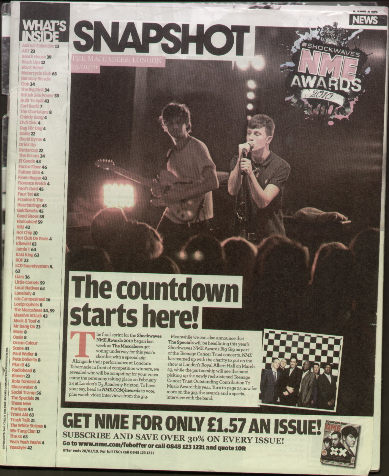
NME: 6th February 2010  


Although from the same magazine the layout of the contents page is drastically different to the previous one. The image dominates the page and there is a short story which follows it. The image is of the band: The Maccabees on stage. It is a natural picture unlike the posed images of bands that music magazines frequently use. The photo is a live action shot as you can see some of the audiences heads and the lead singer feeling his music as his eyes are shut and his face is strained. At the top of the picture is a date, title of the band and location of the gig written in capital white typing in a small red box. The only other images is a small, square posed photograph of another band on top at the bottom of the live picture. They are standing before a checked background in suits and appear to be an old band from the age they look. Additionally as some extra advertising there is an image of an old NME magazine which follows with subscription details.


At the left of the page is a long list in red writing with black page numbers telling the reader 'WHAT'S INSIDE.'  The title is written in bold white with a black background. The colour of the text matches the logo of the NME AWARDS which is placed on top of the main image in the left corner. The logo also includes other colours splashed in the background like paint. The text on the logo is different, sections look like it has been hand written whilst other parts look like its rustic with small straight chunks out of it. 


The layout is simple the image takes over most of the page more that two thirds. There is a long column for the list of articles in the magazine. Finally there is a small section for the advertisement at the bottom of the page. It is very ordered and makes it pleasant to view. 


I don't like this contents page as much as some of the others because they have focused on the small story and made the image the most predominant part of the page. The first column with the list on almost looks like it has been squashed into that section of the magazine. However i do like that there is a main image on the page as some content's use many which can make it look like a mess.